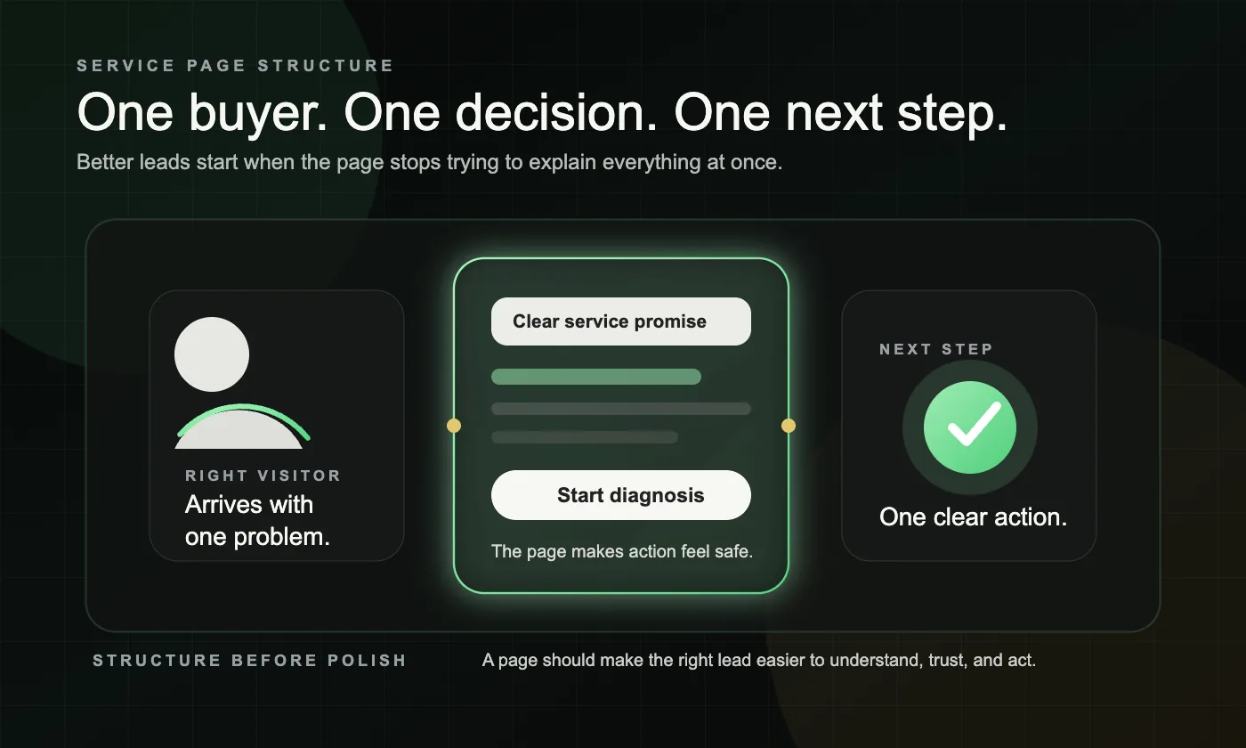
A service page should be structured to help one specific buyer make one specific decision. The highest-converting pages do that in a simple order: clear promise, clear fit, clear service explanation, clear proof, and one clear next step.
If your current pages feel visible but still too broad, too thin, or too hard to act on, our Lead Gen Rebuild page explains how we rebuild service pages, page roles, and routing together.
Why does service page structure affect lead quality?
Because structure decides whether the right visitor feels confident enough to continue. A page can attract clicks and still lose good leads if the service is unclear, the fit is vague, the proof is weak, or the next step feels harder than it should.
Strong service pages do not just “describe the service.” They reduce uncertainty in the order a buyer actually experiences it. That is why a well-structured page improves lead quality, not just conversion rate.
A good place to start is by reviewing which queries and pages earn clicks, then comparing those pages against how real visitors engage once they arrive. Google explains how Search Console and Analytics can be used together for that kind of review.
What diagnosis framework should you use before restructuring a service page?
Use a five-part diagnosis before you rewrite anything: ownership, opening, proof, path, and support. If one of these layers is weak, the page can still get traffic and still fail to bring the right inquiries.
| Diagnosis area | What to ask | Strong signal | Red flag | What to fix first |
|---|---|---|---|---|
| Ownership | Is this the page that should own the query? | One service intent clearly belongs to one URL | Homepage, blog, or multiple service pages compete for the same query | Decide which page should own the intent |
| Opening | Can someone understand the service and fit in seconds? | The first screen names the service, audience, outcome, and CTA | Vague headline, abstract copy, or too much brand-first language | Rewrite the hero section |
| Proof | Does the page reduce doubt? | Process, examples, testimonials, and trust cues appear before the CTA feels risky | Big claims with no support | Add proof near decision points |
| Path | Is the next step obvious and easy? | One clear CTA, simple form, low-friction contact path | Competing CTAs, buried form, too many choices | Simplify the conversion path |
| Support | Do nearby pages strengthen this page? | Relevant blogs and nearby pages link back to the service page naturally | The page is isolated or support content competes with it | Tighten internal links and page boundaries |
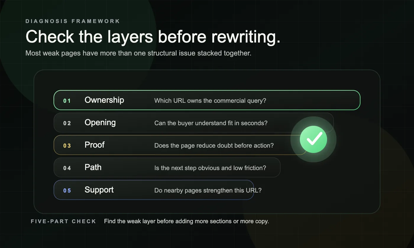
This diagnosis is important because many weak pages do not have one problem. They usually have two or three stacked together.
Which sections should appear above the fold on a service page?
Above the fold, the page should answer four questions immediately: what is this service, who is it for, why does it matter, and what should I do next. If those answers are delayed, serious buyers start scanning for exit points.
Use this above-the-fold checklist:
- A clear H1 that names the service in plain language
- A short supporting line that explains the outcome or situation the service is for
- One primary CTA
- One fast proof cue, such as a testimonial line, review count, case-style result, or process credibility marker
- Optional fit language if the service is only right for certain situations
This area does not need to say everything. It needs to make the right person keep reading.
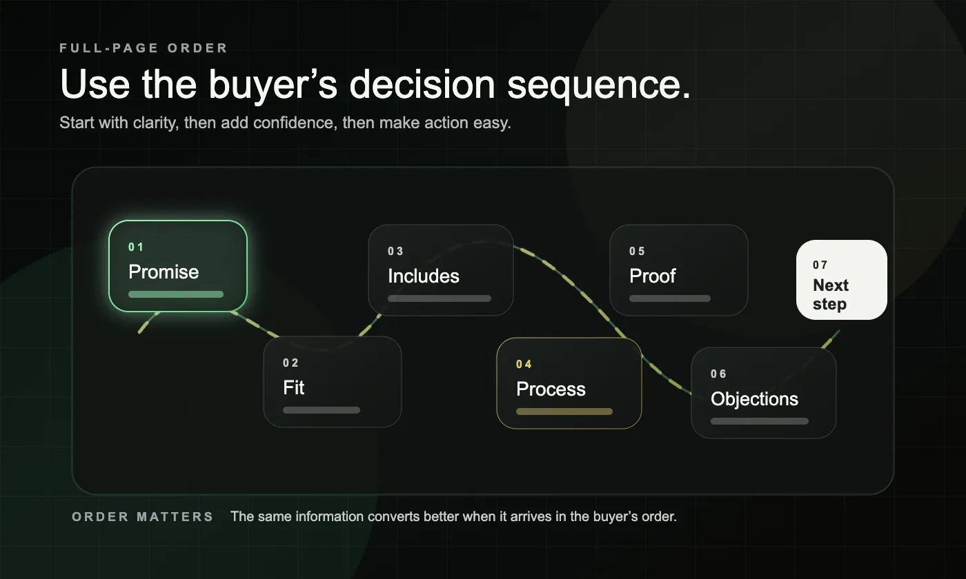
What is the best full-page structure for better leads?
The best structure follows the buyer’s decision sequence, not the business’s internal menu. Start with clarity, then add confidence, then make action easy.
1. Start with a clear service promise
Lead with the exact service and the change it helps create. Do not make the visitor decode what you do from a slogan.
A strong opening makes the page feel specific immediately. A weak opening makes the whole page feel riskier than it needs to.
2. Name the problem and the fit
After the opening, show that you understand the situation that brings someone here. Explain who the service is for, what problem it solves, and when someone should keep reading.
This is also where better lead quality starts. When the fit is clearer, the wrong prospect filters out and the right one leans in.
3. Explain what the service includes
Once the visitor feels seen, explain what the service actually is. Keep it practical: scope, deliverables, priorities, or the type of outcome the work is built to support.
This section should make the service easier to picture, not more abstract.
4. Show how the work happens
A short process section lowers anxiety. Buyers want to know what happens after contact, how the work is handled, and whether the experience will feel organized.
You do not need to reveal every internal detail. You only need enough process clarity to make the next step feel safer.
5. Add proof where decisions happen
Proof should appear where the buyer is deciding, not only at the bottom of the page. Use testimonial snippets, anonymized examples, before-and-after context, review cues, or short proof blocks tied to the service on the page.
Generic proof does less work than specific proof. The closer the evidence feels to the exact service, the stronger the page becomes.
6. Answer objections before they become exits
A strong service page handles hesitation before the visitor leaves to compare options. That usually means short FAQs, fit guidance, expectation-setting, or a simple non-fit section.
This is one of the easiest ways to improve lead quality. It helps the right buyer move forward and helps the wrong buyer self-select out.
7. End with one simple next step
The page should close with one obvious action. Do not turn the last section into a new menu of options.
If the next step is a call, request, estimate, or diagnosis, say what happens next so the visitor is not guessing.
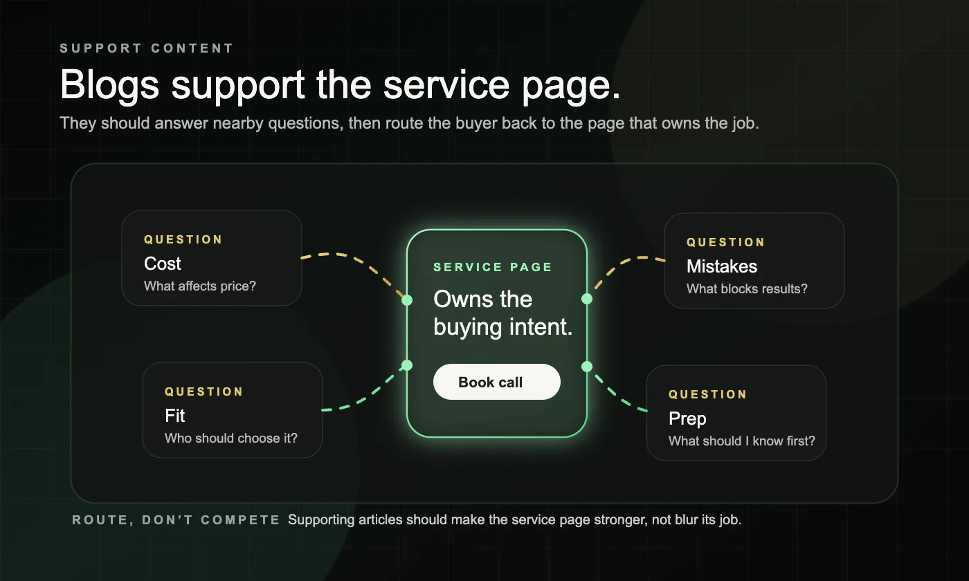
How should support content connect to a service page without causing overlap?
Support content should answer adjacent questions and then route people back to the main service page. It should build trust around the service, not try to replace the service page’s commercial job.
That usually means blog posts handle comparison questions, prep questions, cost questions, fit questions, and mistake-avoidance questions, while the service page owns the main buying intent. Our content funnels approach shows how that support layer works without turning every blog into a competing money page.
When you add internal links, keep them descriptive and natural so people and search systems can understand where the link leads before clicking. Google’s link best practices are a useful baseline here.
What does this look like in a real service business example?
A better structure usually changes the page’s sequence more than its design. Two common scenarios show the difference.
Composite example 1: A home service company had one page that tried to cover repairs, maintenance, and installations at once. The page got traffic, but the headline was generic, the service fit was unclear, and the CTA did not match urgent intent. The fix was to let one page clearly own one service, tighten the first screen, add a short process section, and move proof closer to the main CTA.
Composite example 2: A B2B service firm had a polished page with strong branding but weak decision support. A visitor could tell the company was credible, but not who the service was best for, what was included, or what happened after inquiry. Restructuring the page around fit, process, proof, and one clear next step made the page easier to trust and easier to act on.
In both cases, the winning change was not “more copy.” It was putting the right information in the right order.
What should you fix first on an underperforming service page?
Fix the first screen and the page’s job before you touch secondary details. More sections and more words rarely solve a page that still feels vague in the first few seconds.
Use this order:
- Decide which service intent the page should own
- Rewrite the opening so the service, fit, outcome, and CTA are unmistakable
- Add a short process section and stronger fit guidance
- Move proof closer to the places where the buyer hesitates
- Simplify the next step so action feels low-friction
- Clean up mobile and performance friction after the page meaning is clear. Google’s Core Web Vitals documentation is a useful reference for this layer.
If this checklist reveals a system problem instead of a single-page problem, our Lead Gen Rebuild page is the best next read.
What mistakes keep service pages from generating better leads?
Most weak service pages fail in predictable ways. They either try to do too much, say too little, or make the next step feel harder than it should.
Common mistakes and red flags include:
- One page trying to sell several distinct services at once
- A brand-first hero section that never clearly names the service
- No fit guidance, so the page attracts curiosity but not qualified inquiries
- Process details hidden too deep or missing entirely
- Proof that is generic, unrelated, or buried below the fold
- Several competing CTAs instead of one clear path
- Support blogs that rank, but never route visitors back to the service page
A useful test is simple: if someone lands on the page and still has to ask what the service is, whether it fits, or what happens next, the structure is still doing too little work.
Frequently asked questions
How long should a service page be?
Long enough to explain the service, the fit, the proof, and the next step without filler. Length matters far less than clarity and sequence.
Should a service page include pricing?
Sometimes, but not always. If exact pricing varies, explain what affects scope, timing, or estimate range so the page still reduces uncertainty.
Can one service page target multiple services?
Usually not well. When the services solve different problems or attract different searches, separate pages usually create better clarity and better lead quality.
Do blog posts help service pages convert?
Yes, when they answer nearby questions and naturally route readers back to the main service page. No, when they try to own the same commercial intent the service page should own.
Get a free clarity diagnosis.
If your service pages feel active but still hard to trust or act on, get a free clarity diagnosis.